
The Beach House That Forgot It Was on the Water
- Heather
- 4 hours ago
- 3 min read
By Heather Martin, Metta Home | Pirates Cove, Manteo NC
I stayed at the Blue Marlin while I figured out what it needed. That's how I like to work when I can — sleep in a space, make coffee in it, sit with the morning light, notice where you reach for something and it isn't there. You can't understand a home until you've lived in it a little.
The Blue Marlin is a soundfront condo in Pirates Cove, a marina community in Manteo on the Outer Banks. There's a channel right outside. Water, boats, that particular OBX light that makes everything feel softer. And when you walked through the front door? You felt none of it.
The kitchen was walled off from the rest of the home — dark, closed in, dominated by a bank of upper cabinets that blocked every sightline. The deck faced the sound, but double doors kept it sealed like a room nobody was allowed to use. A freestanding fireplace with a floor-to-ceiling gold chimney pipe stood in the middle of the dining room like it owned the place. Four different flooring materials competed across the first floor. There was no pantry. There was no flow. There was a home that had stopped trusting itself.
"There was a home that had stopped trusting itself."

Here's what I knew after two days living there: the bones were extraordinary. The views were always there. We just needed to get out of the way and let the house do what it wanted to do.
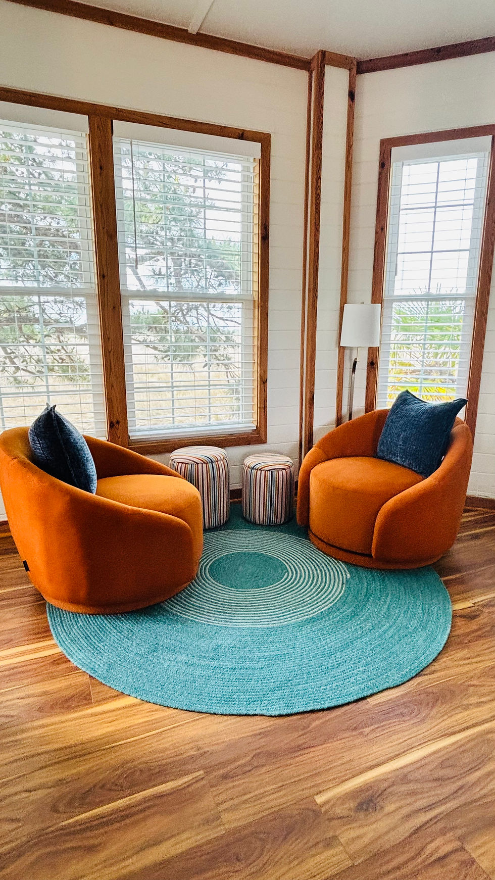
The design plan called for opening that enclosed porch entirely, removing the doors and windows, painting the the room. Macko Construction executed it beautifully. That room became the Reading Porch: two burnt orange velvet swivel chairs on a teal braided rug, facing the sound. Now when you walk in the front door, your eye goes straight through to that space. The water is the first thing you see. That's it. That's the whole idea.
The kitchen wall came down. The towering upper cabinets came down. Light came in. The peninsula stayed but the design gave it a new identity quartz countertops, navy beadboard base, handblown globe pendants I sourced to hang above it like jewelry. A pantry was carved out of the closet that had been holding the hot water heater (relocated to the laundry closet, converted to tankless, one of those changes that sounds small and changes everything).
The old freestanding fireplace came out. The design called for a new gas fireplace relocated to the corner same warmth, zero wasted space. And in the exact spot where that space hog once sat I had some custom shelving built in. Books. Some decor. The things that tell you someone lives here and loves it.
I specified one continuous LVT to replace all four flooring materials, a warm wood tone that runs uninterrupted through every zone. Then came the furnishings: a large beaded chandelier over the dining table, custom table that nests over the ottoman, a new entry console, and a wallpapered wall that greets you at the door and says: this is a designed home.

Upstairs, the design plan included converting the primary bath's unused tub to a large walk-in shower — hexagonal mosaic floor, built-in niche, rain showerhead. I selected the floor tile to coordinate with the existing granite vanity. Two materials, having a conversation now instead of ignoring each other.
My client is going to rent this home for the next few years. Her grandchildren will run through it. Guests will cook in the kitchen and sit on that porch and look at the water. And eventually, she and her husband will settle into it as their own.
That's a lot of different lives to design for. But here's the thing about working with someone on a fourth project together you know them. You know how they move through a space, what lights them up, what they'll never say out loud but absolutely mean. The color palette for this home came from that knowing. Not from a trend board but from years of paying attention.
What I've learned is that designing to the senses doesn't mean designing for a moment it means designing for all of them. Materials that feel luxurious and hold up. Colors that feel like the place you're in. Spaces that are beautiful to look at and even better to be inside of.
She walked in when it was finished and gave it a 12 out of 10.
I'll take that.


Comments